


Cantine Virgili: progettazione della corporate identity
e packaging dei prodotti
Realtà vinicola presente sul territorio mantovano dal 1900, Virgili è un'azienda dalle forti potenzialità espansive per la quale è stata studiata un'identità coordinata funzionale, in risposta ad un bisogno: coesione dell'immagine aziendale, rafforzamento della stessa e promulgazione dei valori fondanti, sono stati i concetti che hanno guidato la progettazione.
Tesi di laurea di natura progettuale.
Virgili is a winery based in Mantua since 1900 with a strong potential for expansions; for it has been studied a functional coordinated identity, to solve and improve the cohesion of the corporate image, the reinforcement of it and the promulgation of the founding values, bases on which the project was founded.
Project degree thesis.

Il progetto che segue è il risultato di un'attenta analisi circa il posizionamento aziendale di Virgili, di un brief dettagliato risultante da interviste personalmente sottoposte ai proprietari; sono state effettuate ricerche di mercato, visite al Vinitaly 2017 per comprendere il panorama vinicolo italiano, le immagini aziendali e i competitor; è stato studiato il consumatore anche grazie ad un'intervista sottoposta a un campione di circa 150 persone, per capire quali fossero i principali aspetti considerati nella scelta di uno specifico vino.
Il tutto ha permesso di avere un chiaro focus a individuare i punti di forza e di debolezza sui quali agire in un progetto di modifica della corporate identity aziendale e del packaging dei prodotti.
The following project is the result of a careful analysis of the corporate positioning of Virgili, of a detailed brief resulting from interviews personally submitted to the owners; searches have been carried outmarket, I visited Vinitaly 2017 to understand the Italian wine scene, corporate images oh others and competitors; the consumer was also studied with an interview submitted at about 150 people, to understand what were the main aspects considered when they choose a specific wine. All this allowed us to have a clear focus on identifying the strengths and weaknesses to modify a project to change corporate identity and products packaging.


Il concept individuato si basa sulla rappresentazione di territorio e crescita. La natura è la miglior testimonianza di sviluppo: dal terreno, grazie ad un seme, nasce la vite; la vite ha radici che sono cresciute nel tempo e hanno permesso ai rami di svilupparsi e di creare foglie che daranno i grappoli d’uva, necessari per la creazione del vino, risultato di tradizioni tramandate di generazione in generazione. Tutto ciò è crescita e si ritiene che questa sia la chiave da trasporre nell’identità di marca, sinonimo di testimonianza e innovazione, in vista del futuro.
The concept identified is based on the representation of territory and growth. Nature is the best evidence of development: with a seed from the ground, we can have wine; it has roots that have grown over time and allowed the branches to develop and create leaves that will give the bunches of grapes, needed for the creation of wine. This is the result of traditions handed down from generation to generation. All this is growth and it is believed that this is the key to be transposed into the brand identity, synonymous of testimony and innovation, for the future of the brand.


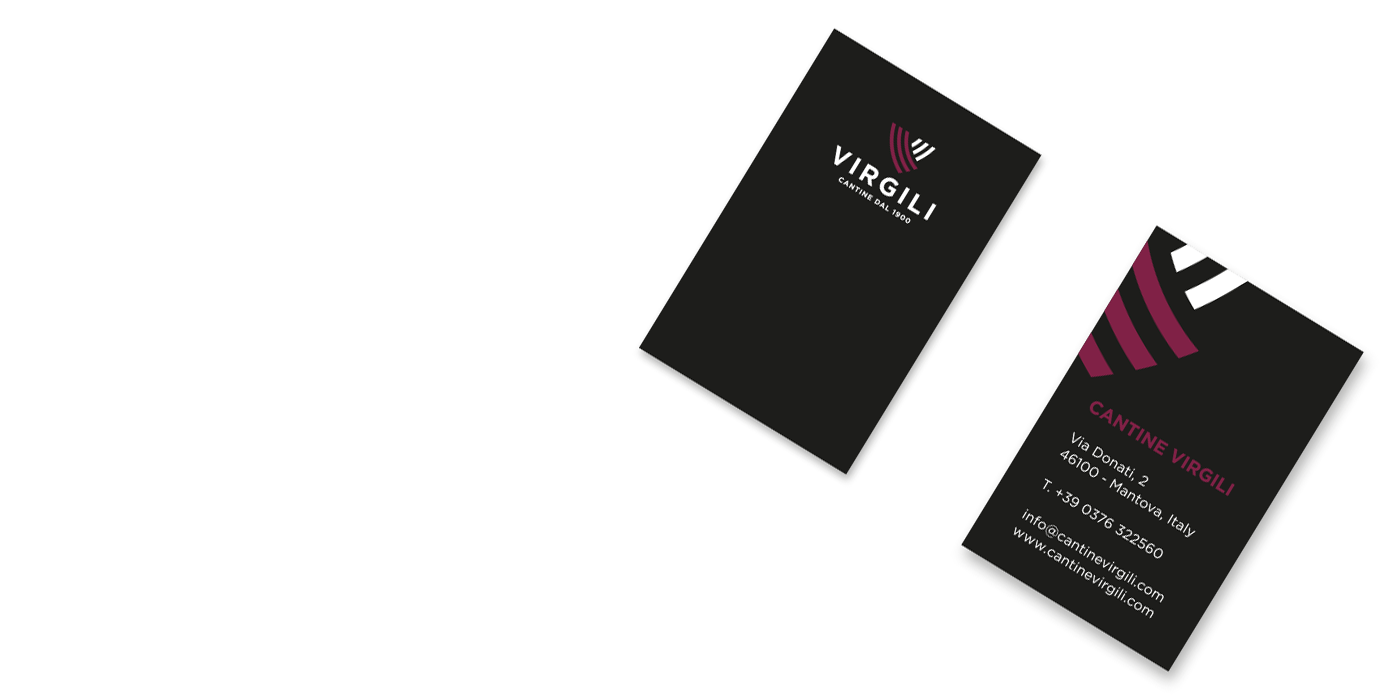

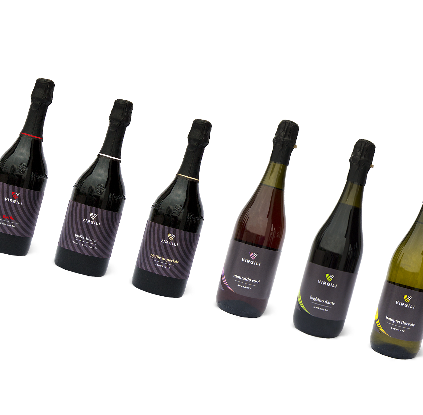
Il principale veicolo di comunicazione del prodotto vino è la sua etichetta; il progetto in esame segue la costruzione di due differenti tipologie di label, la prima viene pensata per avvolgersi sulla superficie della bottiglia e si posizionerà sui vini standard, mantenendo la stessa struttura e variandone le tonalità cromatiche, trova l’unione delle linee di costruzione nel fulcro alla base della visione frontale da scaffale. La seconda invece, diversificata a sostegno della particolarità dei tre vini Pjaföc, si compone di etichetta e contro-etichetta di dimensioni rettangolari, dalla grafica avente stessi riferimenti ma differente disposizione. Viene inserito un elemento calligrafico personalmente realizzato, sinonimo di firma, vuole essere garanzia di sicurezza e qualità agli occhi del consumatore, denota gli aspetti artigianali del lavoro, ed è inoltre un richiamo alla tradizione del Made In Italy.
Label is the main vehicle for the communication of wine; the project follows the construction of two different types of labels, the first is designed to wrap around the surface of the bottle and will be placed on standard wines, maintaining the same structure and changing the chromatic tones, finds the union of the construction lines in fulcrum at the base of the front shelf view. The second, diversified in support of the particularity of the three wines Pjaföc, consists of label and counter-label of rectangular dimensions, the graphics having the same references but different layout. There's a calligraphic element, synonymous of signature, intended to be a guarantee of safety and quality in the eyes of the consumer, denoting the craft aspects of the work,and it is also a reference to the Made in Italy tradition.


Per quanto riguarda il vino Pjaföc, particolare bevanda che si regala a Natale, si acquista per cene e ricorrenze speciali, si decide di dedicare ad esso una confezione regalo semplice ma dall’alto valore concettuale.
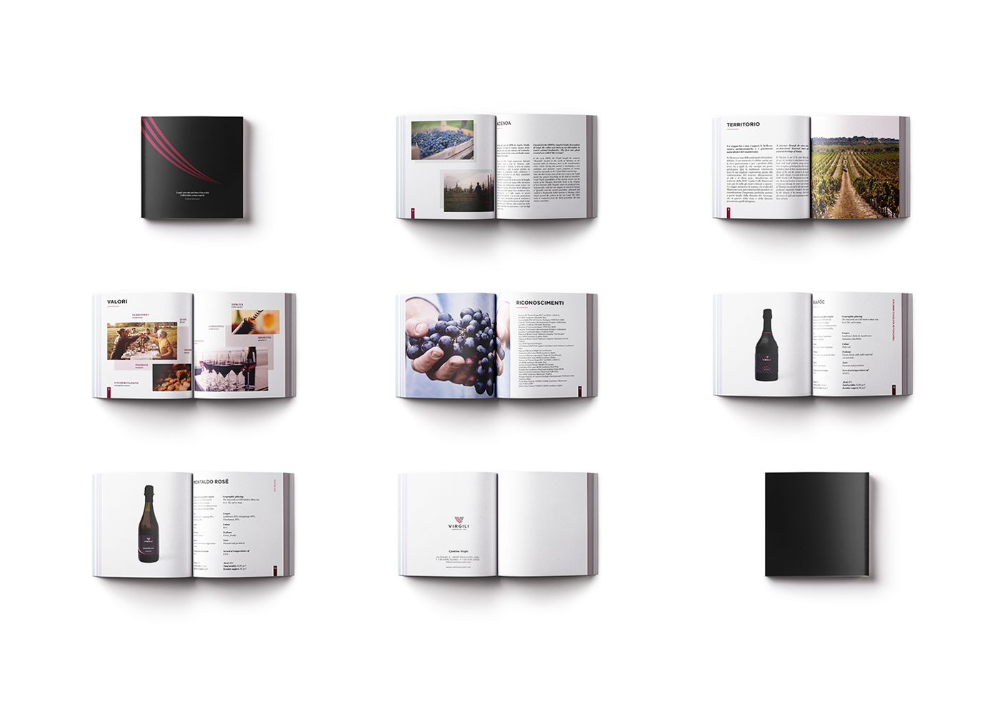
Virgili è presente sul territorio e impegnata in numerosi eventi, fiere e manifestazioni: si struttura quindi una brochure, pensata per confermare, rafforzare e radicarne l'immagine, progettata per essere decisamente semplice: le piccole dimensioni permettono di conservarlo senza sforzi tra le mani e di poterne consultare facilmente il contenuto.
Virgili è presente sul territorio e impegnata in numerosi eventi, fiere e manifestazioni: si struttura quindi una brochure, pensata per confermare, rafforzare e radicarne l'immagine, progettata per essere decisamente semplice: le piccole dimensioni permettono di conservarlo senza sforzi tra le mani e di poterne consultare facilmente il contenuto.
Si struttura inoltre un pieghevole distribuito in sette ante che fungerà da pratico omaggio per i destinatari, circa la conoscenza di Virgili e sarà possibile affiancarlo a regali, acquisti ed eventi.
The Pjaföc, a particular wine purchased for dinners and special occasions, I decided to create a simple gift box but with a high conceptual value.Virgili is engaged in many events and fairs in the city: so they need a brochure, designed to confirm, strengthen and root the image, designed to be very simple: the small dimensions allow it to be kept effortlessly between the hands and to be able to easily consult the content.There is also a booklet distributed in seven panels that will be a practical gift for recipients, about the knowledge of Virgili and it will be possible to support it with gifts, purchases and events.


Thanks for watching!
Special thanks to:
Marika Sarzi Sartori
All rights reserved
Copyright © 2018


